
This posting has been prompted by a number of people failing to understand what the graphs the government keeps showing in its daily press briefings actually show and mean. In particular, there is one graph, that they feature updated most days, that seems to be giving a misleading impression of what is going on. I will get into teacher mode and endeavour to explain the issue as clearly as I can, and leave you to decide whether it is a cynical deception or not.
This is the graph in question:
This is a screenshot taken directly off the televised briefing to the nation this evening. I have done my best not to distort either axis, so as to leave it exactly as the government presented it. (However, it may be distorted a little in one or other axis by the device you are viewing on, but this is not significant overall).
It has become a familiar feature of the daily briefings and I, and many others no doubt, take a close look to see how we are doing compared to other countries. But I wonder how many have looked at and then understood the axes labelling and small print.
The small print tells us that Day 0 is NOT when the first death occurred, which is what I have found people assuming (not unreasonably), but, as you can see above the graph, Day 0 is the first day 50 deaths were reported. In the UK’s case, this was on 16th of March, when we saw a rise from 35 on the 15th to 71 on the 16th. It was, in fact, ELEVEN full days after the first death occurred (on 5th March).
The axis up the left hand side of the graph, showing the total deaths, goes up in a rather odd looking way (50/100/200/500/1000/2000 etc) and the spacing between the lines looks pretty random too. For example the gap between 5000 and 10000 (an increase of 5000 deaths) looks pretty much the same as the gap between 1000 and 2000 (an increase of just 1000 deaths). This is what is known as a logarithmic scale and is a common enough device in statistical analysis, especially graphing data that explodes in values, as is surprisingly common in science and nature.
Because they are relatively complicated to design and understand properly, it is not something encountered in school before ‘A’ Levels at the very least (and only then by maths and science students). Most people will have never learned anything about them at all.
When looking at the graph above, intuitively most people will interpret it as suggesting a steady increase for every country, with South Korea clearly having lower deaths than everywhere else, and Spain noticeably the worst. This is only partly correct. Yes, Spain is substantially worse than South Korea, but rising steadily? Sorry, that is far from the truth.
If you look closely at the graph, again intuitively, most people notice the line starting to flatten for most countries around about Day 14 or 15. This they assume must be good news. Looks like the start of a downturn, many think. Some are savvy enough to notice that the line for the UK actually steepens a bit around Days 14 and 15 and wonder if this is cause for concern. We are told to not read too much into this as we need to see trends over longer periods. That is fair enough. But the reality of what those slightly less steep lines means in the upper part of a logarithmic graph comes as quite a shock to most once it is shown to them! Prepare for that shock.
So what sort of line graphs have people seen in school and have relatively little trouble understanding? That would be arithmetical graphs. This is a big word for a simple enough idea.
With an arithmetical graph, you would expect to see the axes going up in perfectly equal steps. They don’t always start at zero, that is a somewhat different trick of the trade, but basically each even gap up the side will go up the same amount. So instead of the odd sequence of numbers listed above we might find 1/2/3/4 etc or 10/20/30/40 etc or 50/100/150/200 etc. Any even step up will work.
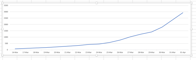
So how would the above graph for the UK look on an arithmetical graph, one that truly represents the day to day change in the figures? I have produced it here using Excel. This starts at the same point, day 16 when the total burst through the 50 barrier and is up to yesterday, as is the graph above. Shocked? 
Dramatically different, isn’t it? All the other countries would have a very similar shape. Where the COBRA Government graph above suggests a flattening off, this one, more accurately would show a slightly less steep curve at best, because really big numbers do not get squashed down dramatically on this sort of graph. On this graph the same amount of deaths each day shows the same size step up in the graph each day. On a a logarithmic graph the same size increase each day gets shown as a smaller step up each day. Deceptive! It will, and does, mislead the unwary!
Now, pedants out there will point out that these graphs can be further distorted by playing around with the axes to make it look flatter or steeper. Both of these are accurate and truthful versions of the same sets of data:
Squash the death axis down; stretch the date axis out. Result is a much flatter line.

Stretch out the deaths axis; squash the dates axis. Result is a much steeper line.
To the uneducated eye these would look like they are telling very different stories. See what I mean about lies, damned lies and statistics. You certainly have to be very wary when politicians start bandying statistics about, and even more so with graphs.
So, for the sake of fairness, I’ve attempted to line up the two graphs next to each other so that the date axis is the same. and the deaths axis takes up the same space on the page. (This may not come out too well, depending on the device you are viewing on, but at least I’ve tried!). Remember, I’m only lining up with the UK line on the COBRA graph. 
So why has the government chosen to present the data using a logarithmic scale and starting from 50 instead of zero? Well, Spain and Italy would be way off the top of any practical arithmetic graph some time ago, so this method is far more manageable for the data (but only beyond, say, day 20 or so). Below 50 deaths would not really register as much other than a flatline at the bottom. So it is not entirely unreasonable to use this technique as a statistician. But without proper explanation and understanding it can be very deceptive to the general public.
The lesson I want to leave you with, is that only an arithmetical graph that starts from zero is a totally ‘honest’ representation of the data, that doesn’t manipulate the patterns shown beyond what the average person in the street would understand. Yet they are surprisingly rare. Whenever you see scales that are not evenly spaced and not starting from zero (unless its dates) then ask yourself what is being hidden and why. If you cannot work it out for yourself, ask a friendly scientist or mathematician!
Talking of which, for those that want to explore this topic little further, I highly commend the Minute Physics Youtube channel, and this short 7min video in particular:
